Highlight important and diagnostic features as efficiently as possible
Contents
Highlight important and diagnostic features as efficiently as possible#
Given human nature, even the best QC reports won’t be consistently used if they are too long, ugly, or annoying. It is often more effective to quickly create short, aesthetically pleasing QC files which emphasize easy-to-check diagnostic features. If these summary files suggest something may be amiss, it can be investigated in detail; trying to fit all possibly-useful images and statistics into one document is often counterproductive.
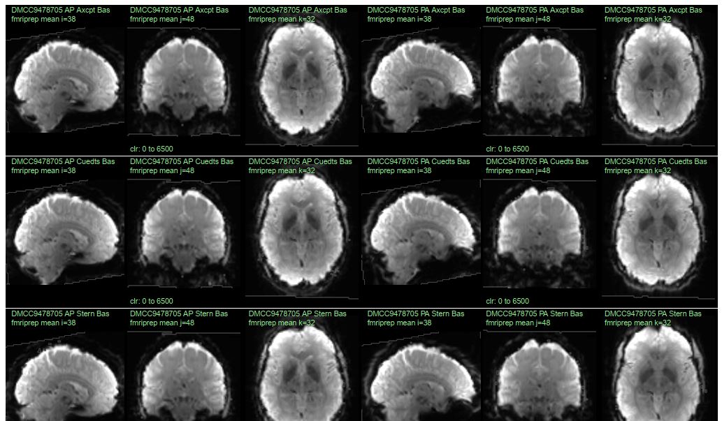
For checking the preprocessing of human fMRI data, we have found that it works well to plot temporal mean images (without masking) and confirm that the volumes look like brains. This is especially valuable if all of the participants’ runs are plotted side-by-side, like below (10 runs can fit on a single page, e.g., pages 12-14 of 132017_fMRI_movementSummary_fmriprep.pdf), enabling many runs to be examined at a glance, and differences between the runs to be spotted.
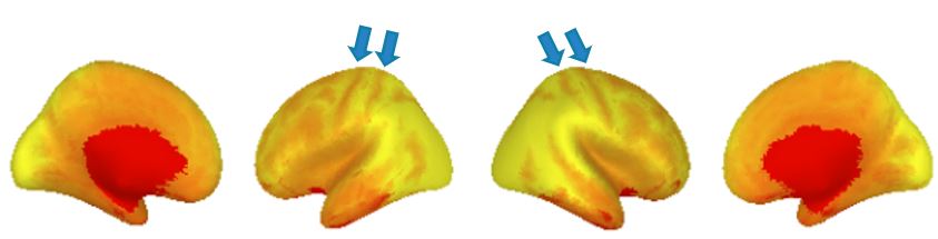
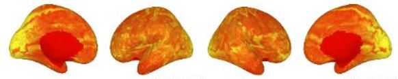
Surface images are more difficult to check for preprocessing errors, because a correctly-made gifti file can always be displayed as a brain. But it’s still worth looking at the surface images as large preprocessing or other problems can be spotted; one feature is that the tiger stripes along the top of the hemispheres due to the central sulcus (arrows) are plainly visible. The lower image shows how a acquisition mishap can appear on the surface; this sort or other non-anatomical patterns (like polka dots) should be investigated. Pages 15-17 of 132017_fMRI_movementSummary_fmriprep.pdf show an array of surface temporal mean images.
Visual displays can help with more than image quality#
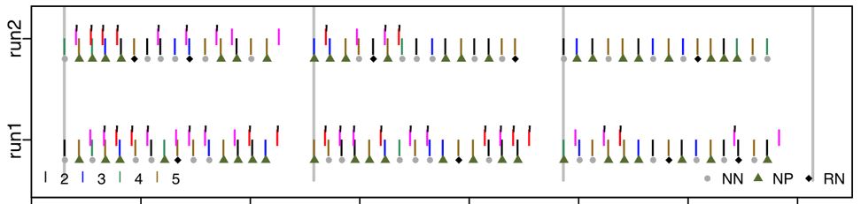
These previous examples are of visual displays for checking MR image quality, but plots can be used to efficiently examine other things, too, such as task performance. This plot shows what a participant did during the DMCC Sternberg task. Time is along the x-axis, and each grey-ish plotting symbol indicates a trial onset (NN, NP, RN, 5:8 refer to trial types). The pink and red lines show the time and identity of each button press, with the black tick marks indicating if the response was correct. With a bit of practice a lot of task and performance information can be quickly seen in these types of plots, including trial jitter, randomization, and unexpected participant response patterns. For example, this participant gave the incorrect response for several trials in each run and block, but got the great majority correct, suggesting that they were attending to the task and trying to do it properly.
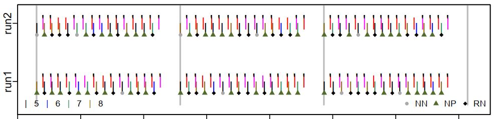
By contrast, this participant responded to a few trials, sometimes correctly, but mostly did not respond at all. The RAs noted that the person was sleepy; we don’t want to include this person’s data in the analyses. It is important to be able to check for this (and other) strange response patterns. For example, if an analysis calculated performance as the percent of trials with a correct response out of the trials with a response, this person’s performance will seem quite good (most trials with a response are correct); the high proportion of trials without a response needs to be considered as well.
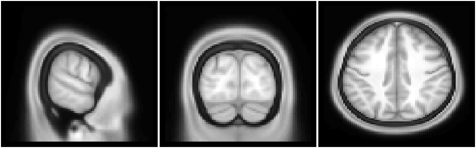
Example: anatomical volume (nifti) image plotting#
Efficiently displaying QC images depends upon being able to easily access and plot the source files. This tutorial shows some basic image reading and plotting, the key foundation upon which more complex files (see links at the end of this page) are built.
library(RNifti);  # package for NIfTI image reading; https://github.com/jonclayden/RNifti

# S1200_AverageT1w_81x96x81.nii.gz (https://osf.io/6hdxv/) is a resampled (via afni 3dresample)
# version of S1200_AverageT1w_restore.nii.gz, the HCP 1200 Group Average anatomy,
# available from https://balsa.wustl.edu/file/show/7qX8N.
img <- readNifti("example2files/S1200_AverageT1w_81x96x81.nii.gz");

# the image values are in a 3d array (since this is a single anatomical image, not a timeseries)
print(dim(img));   # [1] 81 96 81
[1] 81 96 81
Now that the image is read in, many of the normal R commands and operations can be used with it, such as getting the value of individual voxels.
print(max(img));  # [1] 1374.128
print(img[30,20,50]);  # value of the voxel at 30,20,50
[1] 1374.128
[1] 370.3334
Slices through the image can be plotted with the same functions as any other image.
options(repr.plot.width=8, repr.plot.height=2.5);  # specify size in jupyter
layout(matrix(1:3, c(1,3)));  # have three images in one row
par(mar=c(0.1, 0.1, 0.1, 0.1));   # specify plot margins

image(img[15,,], col=gray(0:64/64), xlab="", ylab="", axes=FALSE, useRaster=TRUE);   # plot slice i=15
image(img[,20,], col=gray(0:64/64), xlab="", ylab="", axes=FALSE, useRaster=TRUE);   # plot slice j=20
image(img[,,50], col=gray(0:64/64), xlab="", ylab="", axes=FALSE, useRaster=TRUE);   # plot slice k=50
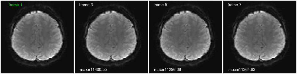
Example: functional volume (nifti) image plotting#
Functional nifti images are read in with the same command, but as a 4d matrix: the three dimensions plus time. This next bit of code reads a functional run from the first DMCC55B participant, downloaded from https://openneuro.org/datasets/ds003465/versions/1.0.5, then edited to only have the first eight frames (so the file wouldn’t be too large).
# load a (small) functional run from the first DMCC55B participant
in.img <- readNifti("example2files/sub-f1027ao_ses-wave1bas_task-Stroop_acq-mb4AP_run-1_space-MNI152NLin2009cAsym_desc-preproc_bold.nii.gz");

print(dim(in.img));  # [1]  81  96  81 8
[1] 81 96 81 8
We can plot the same slice at different times (frames), and calculate statistics from individual frames or across time. The frames look quite similar plotted this way, but there are differences, as reflected in the maximum voxel value on each image and the voxel timecourse below. Can you change the code to print a statistic on the first frame as well? Show different slices and TRs? The values of a different voxel?
options(repr.plot.width=8, repr.plot.height=2);  # specify size in jupyter
layout(matrix(1:4, c(1,4)));  # have four images in one row
par(mar=c(0.1, 0.1, 0.1, 0.1));   # specify plot margins

do.k <- 50;  # which k slice to plot
# so all frames will be plotted with the same color scaling, specify before plotting
z.lim <- c(min(in.img[,,do.k,]), max(in.img[,,do.k,]));  # range calculated across all TRs

# plot one frame
image(in.img[,,do.k,1], col=gray(0:64/64), zlim=z.lim, xlab="", ylab="", axes=FALSE, useRaster=TRUE);
text(x=0.2, y=0.95, labels="frame 1", col='green');  # add a label

# plot with a loop
show.frames <- c(3, 5, 7);  # which (and how many) frames to plot
for (i in 1:length(show.frames)) {   # i <- 1;
  image(in.img[,,do.k,show.frames[i]], col=gray(0:64/64), zlim=z.lim, xlab="", ylab="", axes=FALSE, useRaster=TRUE);
  text(x=0.15, y=0.95, labels=paste("frame", show.frames[i]), col='white');  # add a label
  text(x=0.25, y=0.05, labels=paste0("max=", round(max(in.img[,,do.k,show.frames[i]]),2)), col='white');  # add a statistic
}

print(in.img[20,30,23,]);   # the value of this voxel in all frames
[1] 2933.060 2886.645 2766.290 2902.567 2746.861 2924.964 2581.170 2975.967
Notes and links#
Many neuroimaging-specific plotting functions are available (and not only for R), some static, some interactive. I suggest using the RNifti, gifti, and ciftiTools R packages for file i/o; each includes plotting functions as well. I wrote tutorials for working with nifti and gifti images using these libraries, plus my markdown-friendly plotting functions.
The DMCC55B dataset descriptor paper supplemental files include multiple QC summary files, using R, knitr (latex), and afni. Particularly relevant here are the temporal mean, SD, and tSNR and motion (realignment parameters) examples. Those links are to blog posts describing the supplemental materials, which reside at https://osf.io/vqe92/. Examples of the files created for each DMCC participant may also be useful; see https://osf.io/z62s5/ and other files in the analyses subdirectory. More task behavior summary images and the source code are at https://osf.io/7xkq9/.